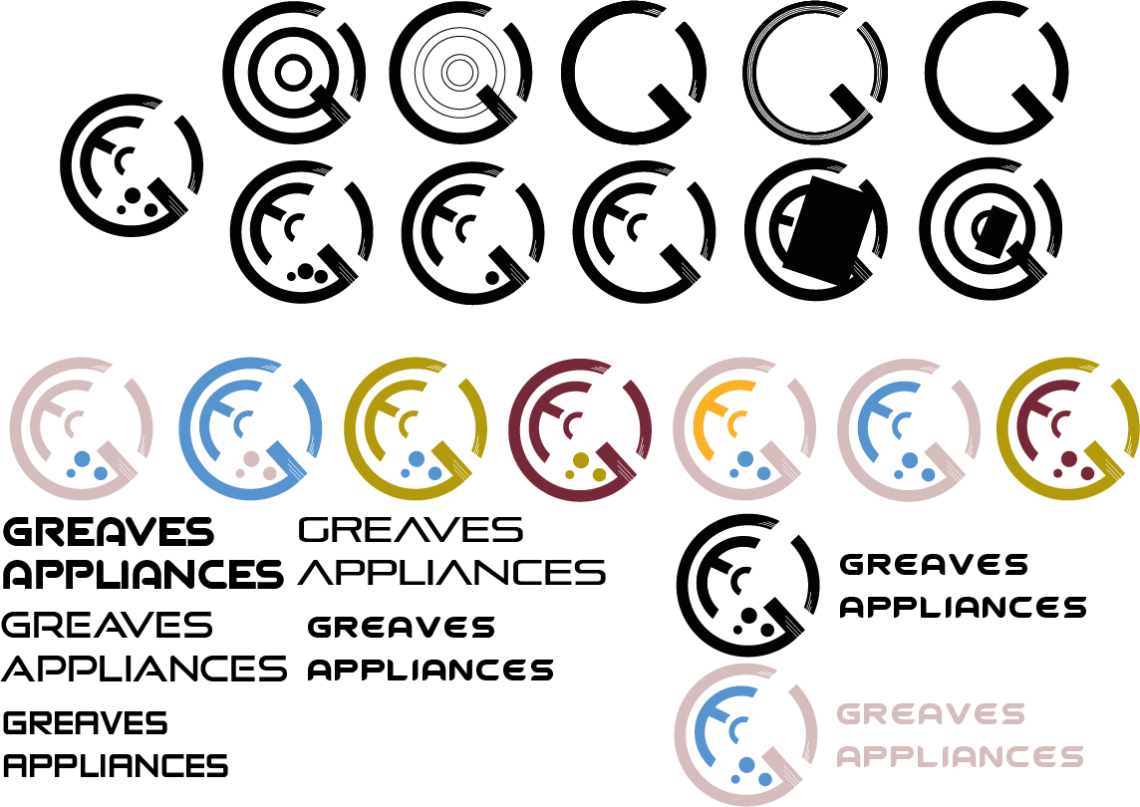
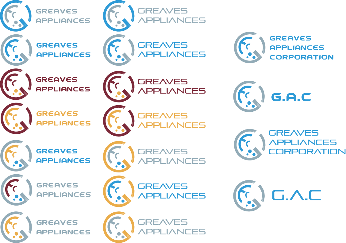
In this task I had to take my best logo concept and experiment with the design, in this stage I had to identify key imagery, type face and colour schemes I will use in my my final out comes.

My logo was created using shapes and the pathfinder tool making my logo straight forward to create, the logo uses imagery of a washing machine to convey the message of the companies main product line being kitchen/household appliances, I also started to play around with different Type and Colour Schemes to try and see which ones conveyed a modern, industrialist, technological message the most effectively.

After plenty of experimentation I was able to narrow down the combinations I wanted to use, I decided on a blue and silver colour scheme as it best conveyed my company’s ethos (modern, industrialist, technological), I also decided that the abbreviated “G.A.C” in the futuristic/sleek type was the best way to help convey my company message with the colour scheme, the bottom right logo design is my personal favourite and shall take it on to the final refining stages.
